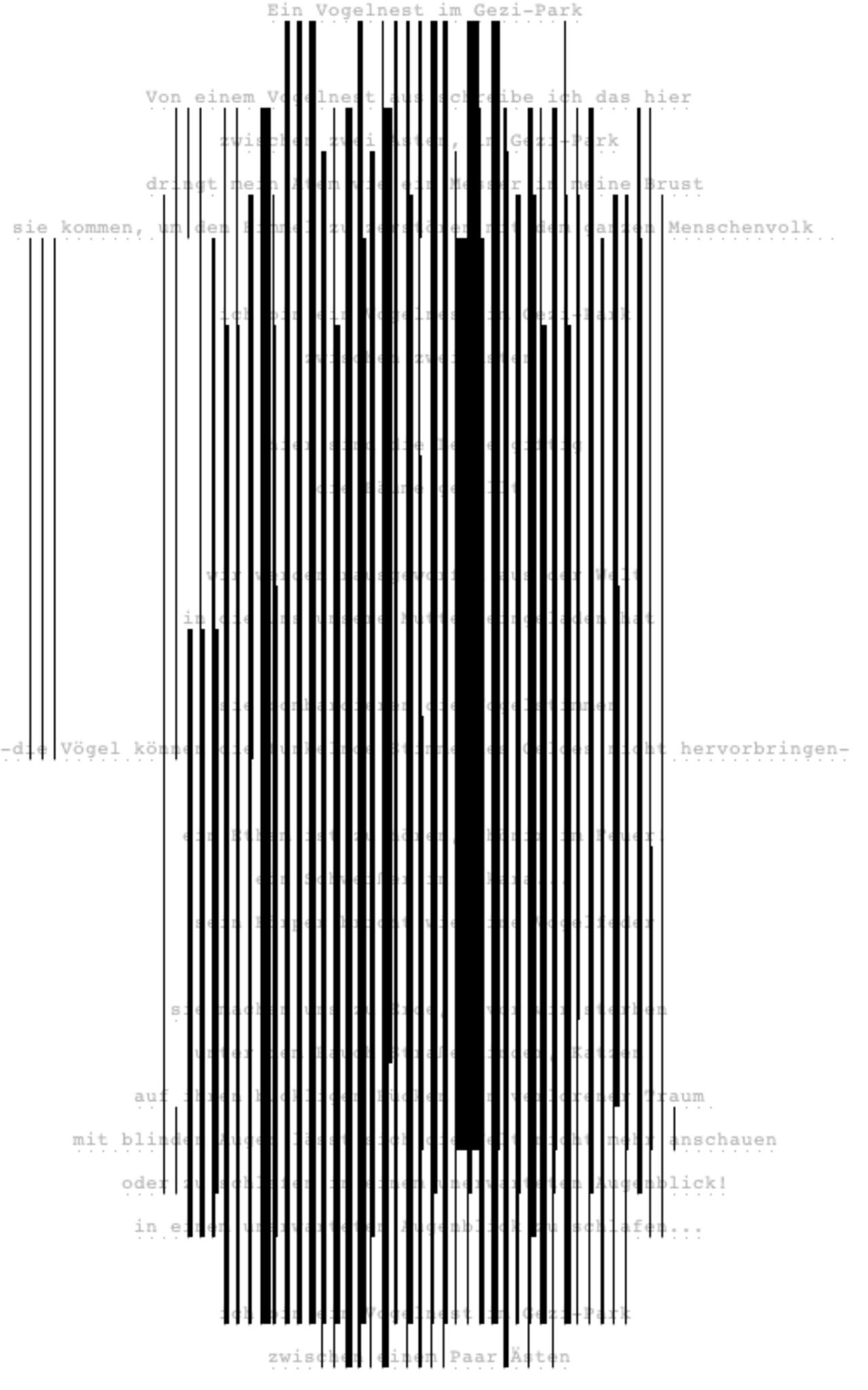
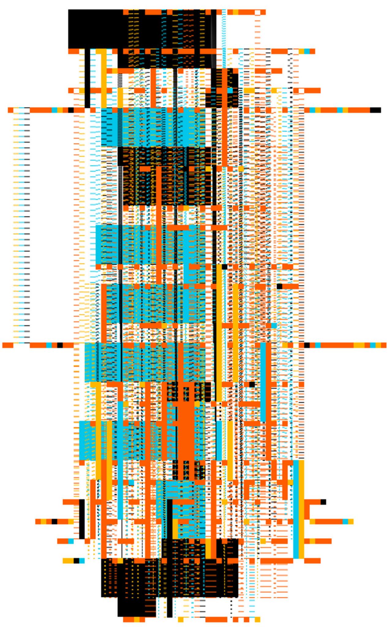
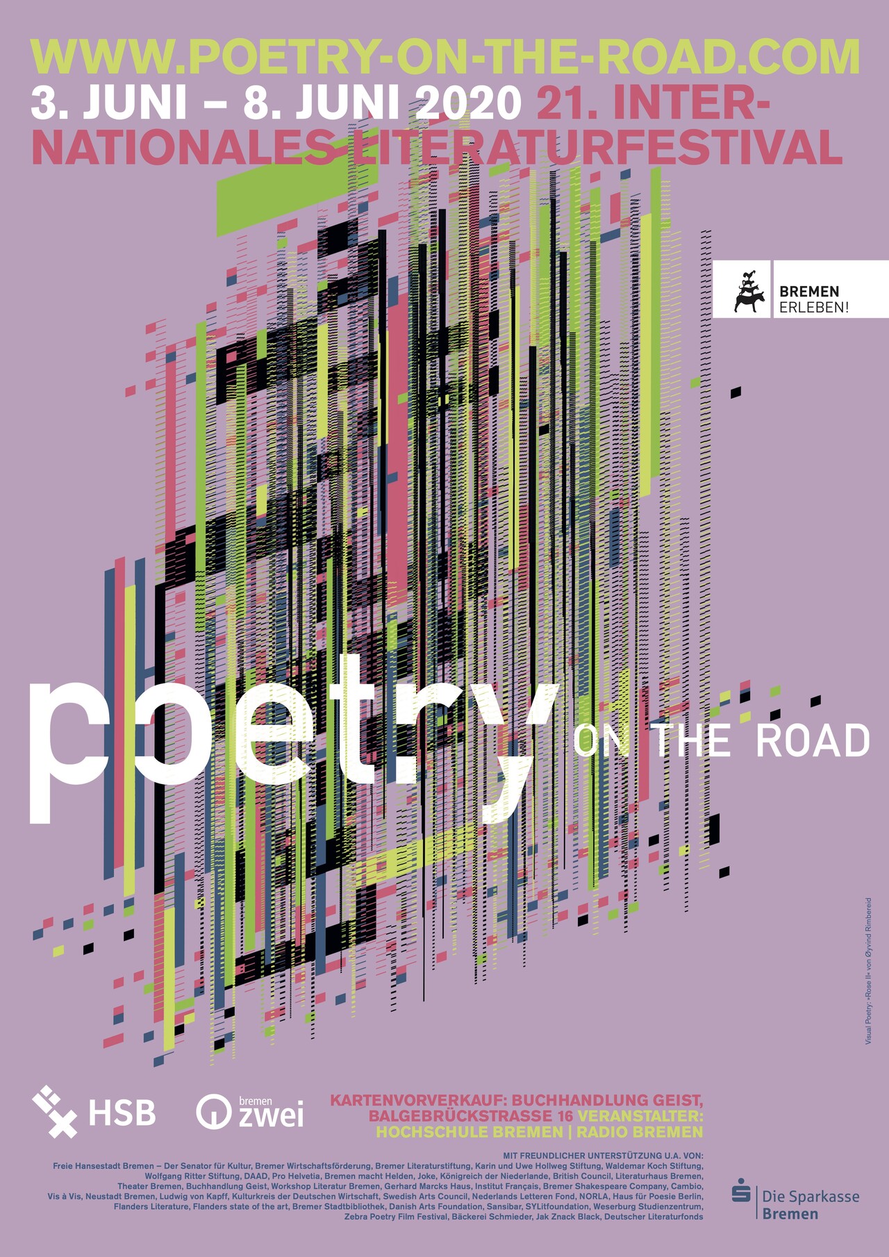
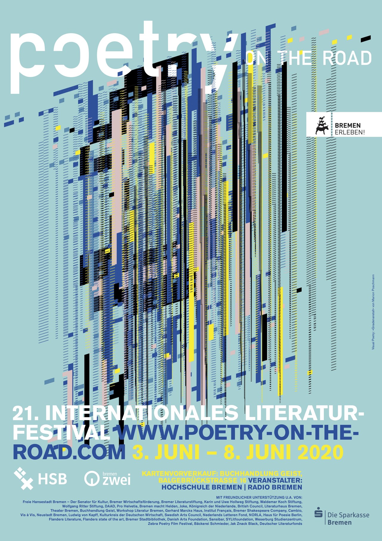
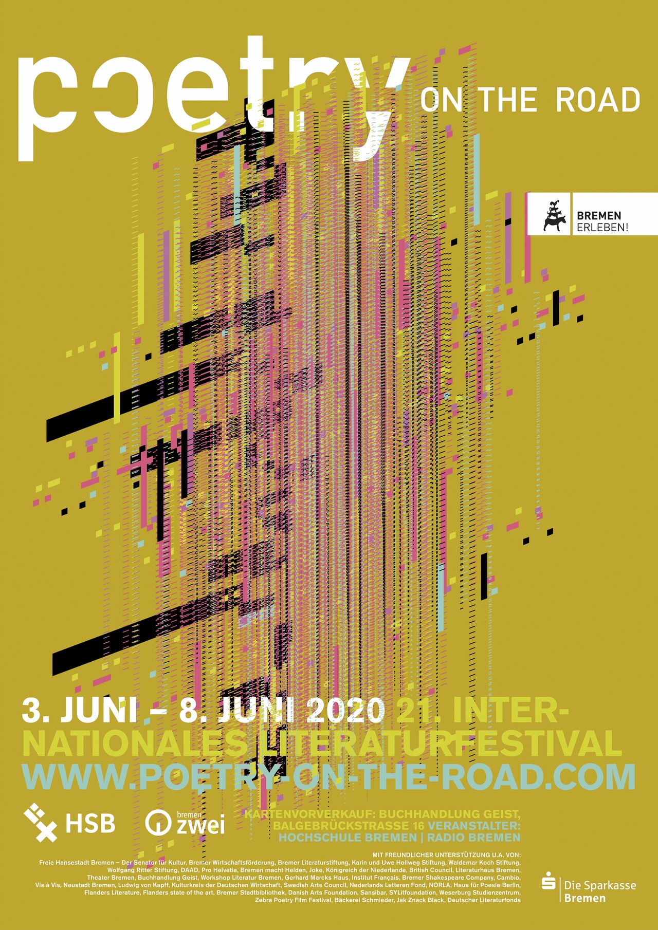
Visualizations of poems using generative design methods for the Poetry on the Road festival.
The visual identity of Poetry on the Road is traditionally based on the use of generative design, namely the algorithmic analysis of poems for generating graphic images.
Our creative process is guided by trends around information technology and by an interest in contemporary visual expressions.
After last year’s evaluations were more concerned with the meaning of the texts, this year the focus was on the smallest unit of the poems: the letter.
In poetry in particular, the letters play a special role; in addition to meaning, they also provide rhythm and structure. They are thus comparable to the notes of a piece of music, or the threads of a weaving structure.
Accordingly, the design of this year’s “visual poetry” followed the interest in creating complex structures from the smallest units.
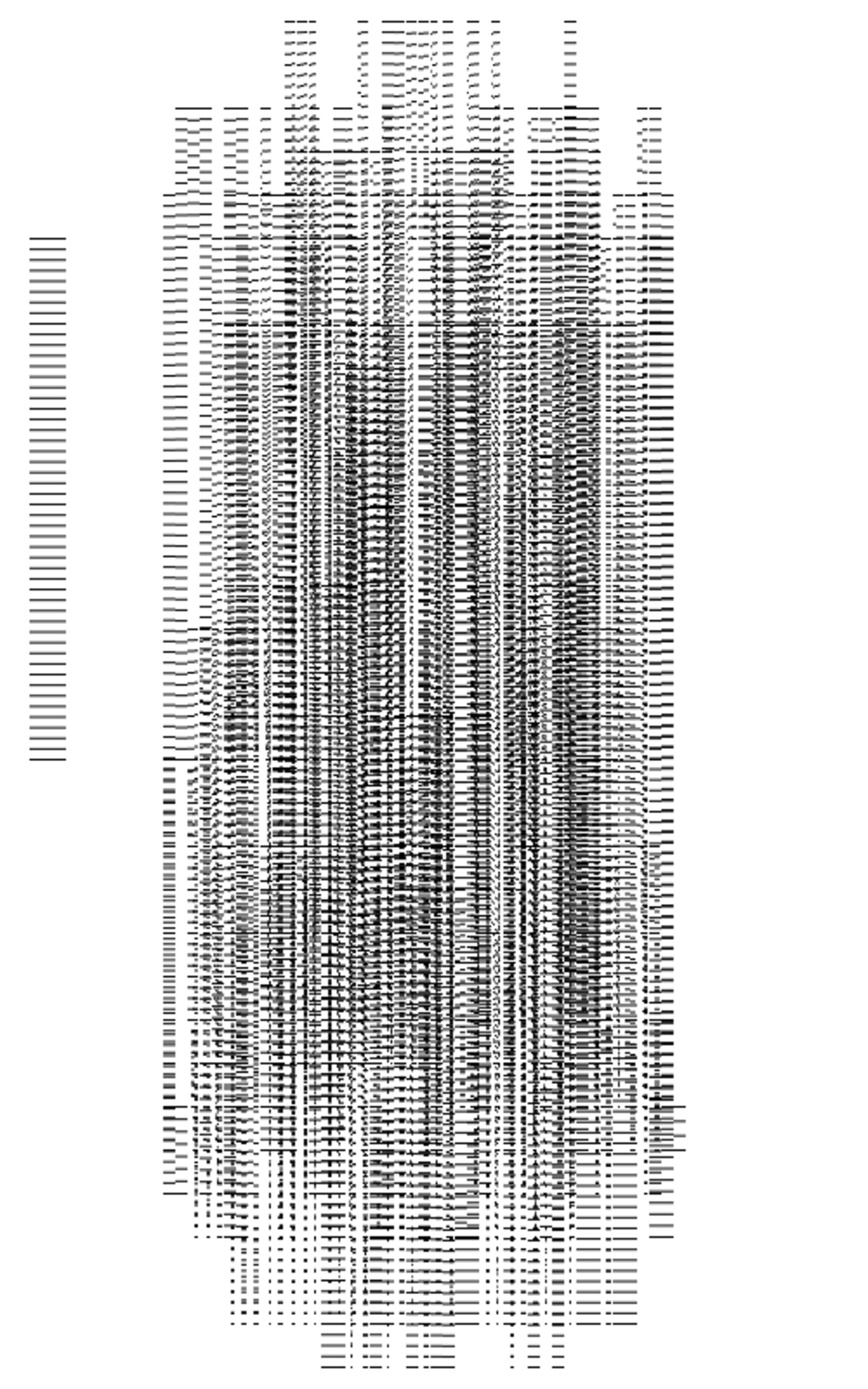
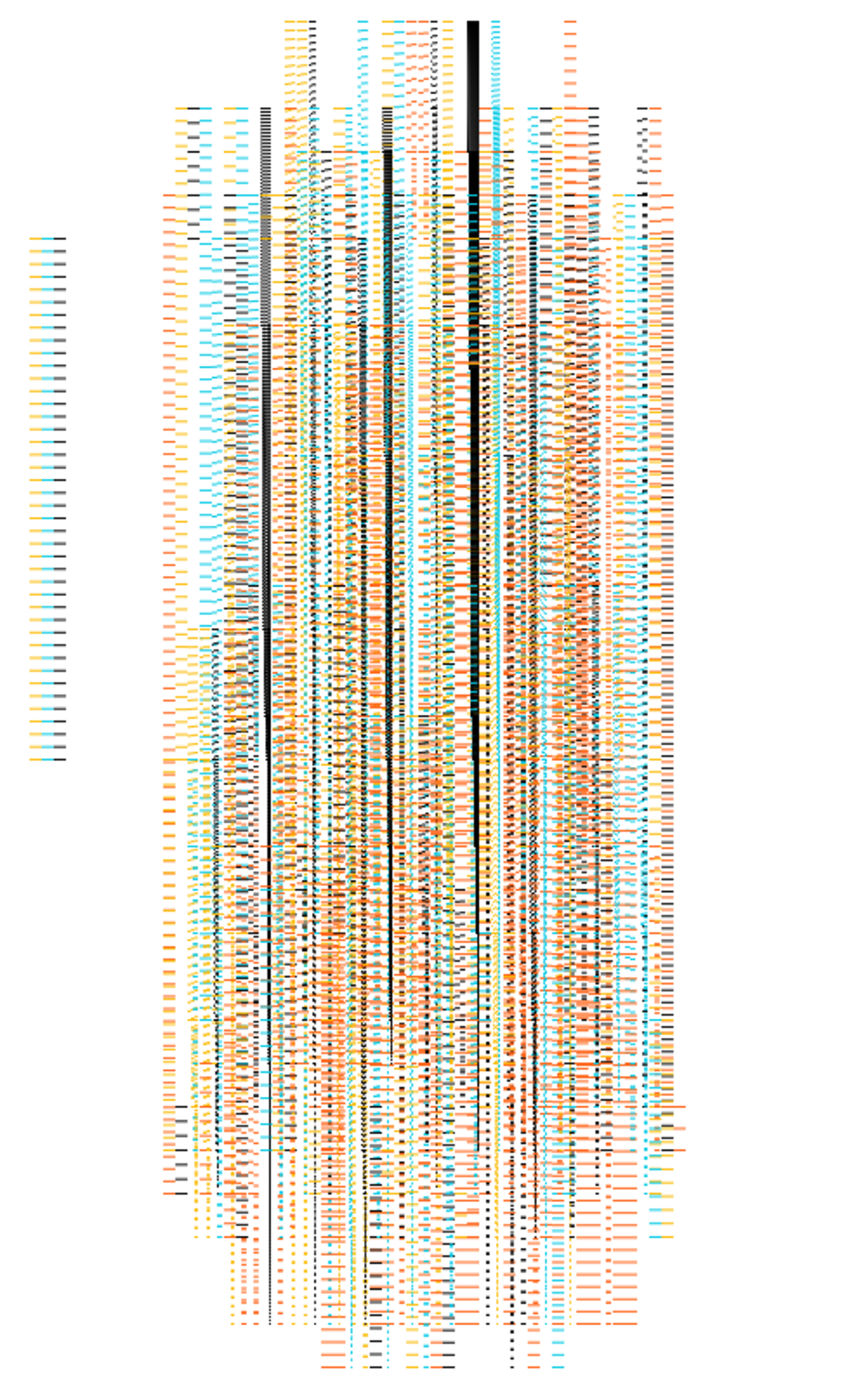
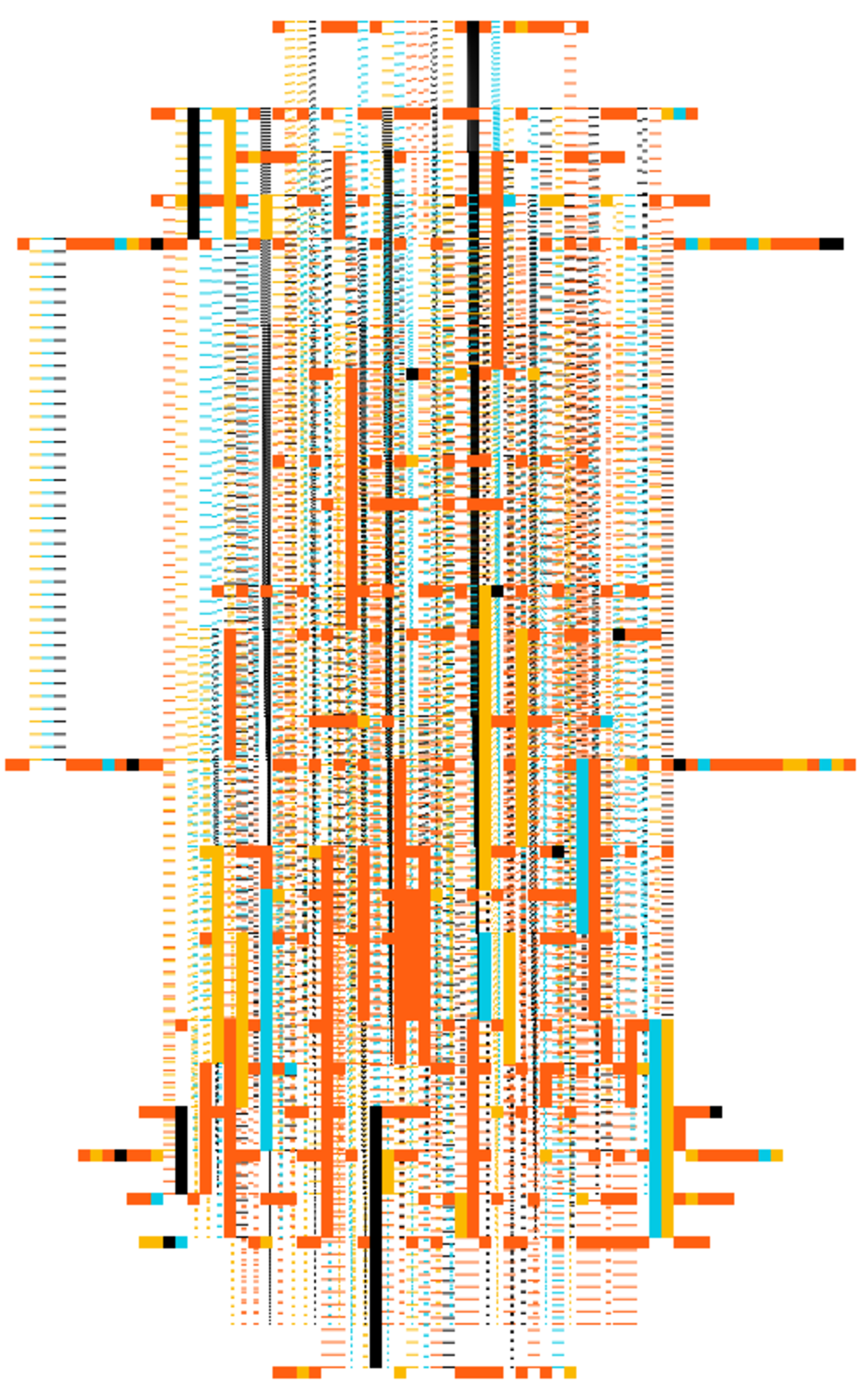
To this end, the computer-assisted analysis process went through various poems line by line and recorded the properties for each letter. The resulting meta-data served as the basis for a visual translation:
Identical letters are connected graphically; the number of connections influences the strength of the graphic connections; the colorfulness results from the occurrence of the respective letter in the overall text; punctuation marks appear as structuring and contrasting blocks; a perspective distortion clarifies the layered composition of the overall structure.
Visualisierung von Gedichten für das Poetry on the Road Festival.
Die visuelle Identität von poetry on the road basiert traditionell auf dem Einsatz generativer Gestaltung, konkreter gesagt der algorithmischen Auswertung der Texte zur Erzeugung von grafischen Motiven. Informationstechnische Strömungen leiten uns beim Entwurf ebenso wie ein Interesse an aktuellen Formen des visuellen Ausdrucks.
Nachdem sich die letztjährigen Auswertungen eher mit der Bedeutung der Texte befasst hat, stand dieses Jahr die kleinste Einheit der Gedichte im Fokus: der Buchstabe.
Gerade in der Lyrik wird den Buchstaben eine besondere Rolle zuteil, sie sind es, die neben der Bedeutung auch für den Rhythmus und die Struktur sorgen.
Sie sind damit vergleichbar mit den Noten eines Musikstückes, oder den Fäden einer Webstruktur.
Dementsprechend folgte die Gestaltung der diesjährigen “visual poetry” dem Interesse, aus kleinsten Einheiten komplexe Strukturen entstehen zu lassen.
Dazu wurden im computergestützten Analyseprozess verschiedene Gedichte zeilenweise durchgegangen und die Eigenschaften für jeden Buchstaben aufgezeichnet. Die daraus entstehenden Meta-Daten dienten als Grundlage für eine visuelle Übersetzung:
Gleiche Buchstaben werden grafisch verbunden; die Anzahl der Verbindungen nimmt Einfluss auf die Stärke der grafischen Verbindungen; die Farbigkeit ergibt sich aus dem Aufkommen des jeweiligen Buchstabens im Gesamttext; Satzzeichen erscheinen als strukturierende und kontrastierende Blöcke; eine perspektivische Verzerrung verdeutlicht die schichtenartige Zusammensetzung des Gesamtgebildes.
Leistungen
Visuelles Konzept, Generative Gestaltung
Partner
one/one - CI, Grafische Gestaltung
Services
Visual concept, generative design
Partners
one/one - CI,Graphic Design